CSS:矩形製作漸層波浪動畫背景
2022/6/30
Rene Wu 2021/04/13 18:14:07
0 1619
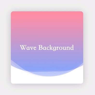
首先在 html 上建立好 3 個 wave 區塊:
<div class="wrapper">
  <div class="wave one"></div>
  <div class="wave two"></div>
  <div class="wave three"></div>
  <div class="title">Wave Background</div>
</div>
開始設定 css 樣式,寬高300px、圓角10px、加陰影以及設制超出範圍 hidden & 標題樣式:
.wrapper {
  width: 300px;
  height: 300px;
  border-radius: 10px;
  box-shadow: 0 2px 30px rgba(0, 0, 0, 0.2);
  background: #fff;
  position: relative;
  overflow: hidden;
  transform: translate3d(0, 0, 0);
}

.title {
  position: absolute;
  left: 0;
  top: 0;
  width: 100%;
  z-index: 1;
  line-height: 300px;
  text-align: center;
  color: white;
  font-family: serif;
  font-size: 30px;
}
接下來開始設定 wave 的樣式:
- 寬高 500px 紫色正方形
- 圓角 40%
- 透明度 40%
- 靠上對齊 並且 水平置中
- 變形物件起啟點設為中間
- 動畫完成一次周期設為 7 秒、並無限重複播放
.wave {
  background: #6a82fb;
  width: 500px;
  height: 500px;
  border-radius: 40%;
  opacity: 0.4;
  position: absolute;
  top: 0%;
  left: 50%;
  margin-left: -250px;
  margin-top: -250px;
  transform-origin: center;
  animation: drift 7s infinite linear;
}
完成 wave 樣式之後,接著設定 第二個 wave 樣式:
- 動畫完成一次周期設為 9 秒、並無限重複播放 (秒數設定多一點,製造階層波浪效果)
.wave.two {
  animation: drift 9s infinite linear;
}
再設定第三個 wave 樣式:
- 動畫完成一次周期設為 11 秒、並無限重複播放
- 除了透過秒數製造階層效果之外,設定透明度 10% 呈現最下層淺色的波浪
.wave.three {
  animation: drift 11s infinite linear;
  opacity: 0.1;
}
動畫設定:
- 矩形 360度 旋轉
@keyframes drift {
  0 {
    transform: rotate(0deg);
  }
  100% {
    transform: rotate(360deg);
  }
}
到這邊已建立好單色的波浪動畫背景
