CSS & SVG :: Blob Animation
2022/6/29
Rene Wu 2022/04/06 17:37:23
0 255
首先,在 html 建立 div:
<section>
  <div class="blob">
  </div>
</section>
並在 css 設製背景及物件對齊方式:
* {
  margin: 0;
  padding: 0;
  box-sizing: border-box;
}

section {
  position: relative;
  display: flex;
  justify-content: center;
  align-items: center;
  min-height: 100vh;
  background: #180110;
}

.blob {
  position: absolute;
  width: 500px;
  height: 500px;
}
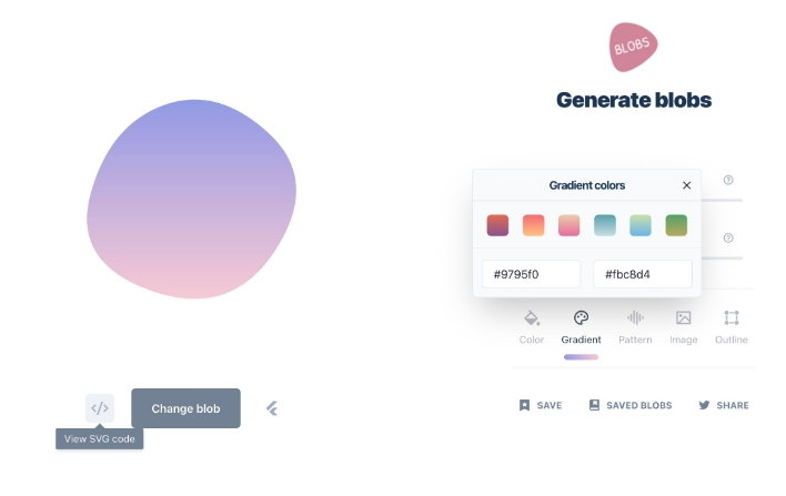
接下來到 blobs.app 網站,這是可以快速建立物件的免費線上工具,它能隨機產生 blob 圖形並設製顏色、漸層、pattern…等等細節。
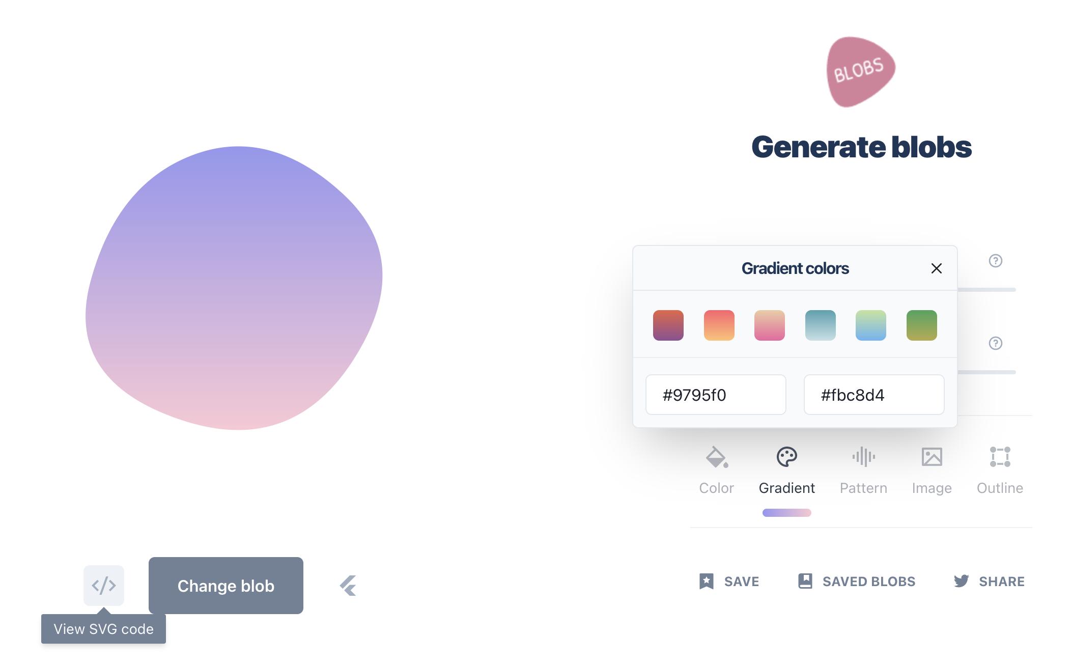
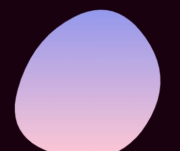
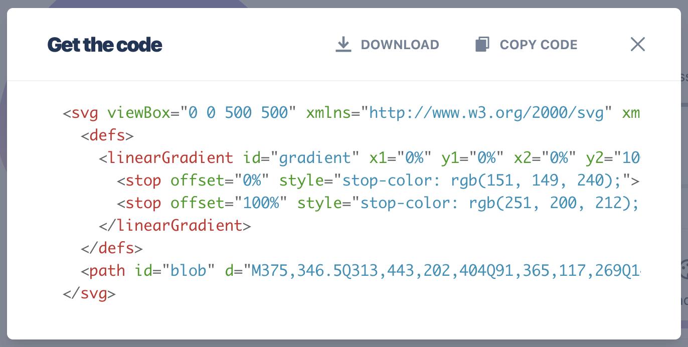
將漸層設定為 #9795f0→#fbc8d4,並點擊「view SVG code」,在 html class blob 裡貼上。
<section>
  <div class="blob">
    <svg viewBox="0 0 500 500" xmlns="http://www.w3.org/2000/svg" xmlns:xlink="http://www.w3.org/1999/xlink" width="100%" id="blobSvg">
  <defs>
    <linearGradient id="gradient" x1="0%" y1="0%" x2="0%" y2="100%">
      <stop offset="0%" style="stop-color: rgb(151, 149, 240);"></stop>
      <stop offset="100%" style="stop-color: rgb(251, 200, 212);"></stop>
    </linearGradient>
  </defs>
  <path id="blob" d="M375,346.5Q313,443,202,404Q91,365,117,269Q143,173,218,145Q293,117,365,183.5Q437,250,375,346.5Z" fill="url(#gradient)"></path>
</svg>
  </div>
</section>
調整 <path> 內容如下:
<section>
  <div class="blob">
    <svg viewBox="0 0 500 500" xmlns="http://www.w3.org/2000/svg" xmlns:xlink="http://www.w3.org/1999/xlink" width="100%" id="blobSvg">
      <defs>
        <linearGradient id="gradient" x1="0%" y1="0%" x2="0%" y2="100%">
          <stop offset="0%" style="stop-color: rgb(151, 149, 240);"></stop>
          <stop offset="100%" style="stop-color: rgb(251, 200, 212);"></stop>
        </linearGradient>
      </defs>
      <path fill="url(#gradient)">
        <animate attributeName="d"
                 dur="10000ms"
                 repeatCount="indefinite"
                 values="M375,346.5Q313,443,202,404Q91,365,117,269Q143,173,218,145Q293,117,365,183.5Q437,250,375,346.5Z">
        </animate>
      </path>
    </svg>
  </div>
</section>
再到 blobs.app 產生四個新的圖形,複製 d 的值依序加在 values 裡,並在最後加上第一組的值,讓動畫循環不會有破綻就完成了。
<section>
  <div class="blob">
    <svg viewBox="0 0 500 500" xmlns="http://www.w3.org/2000/svg" xmlns:xlink="http://www.w3.org/1999/xlink" width="100%" id="blobSvg">
      <defs>
        <linearGradient id="gradient" x1="0%" y1="0%" x2="0%" y2="100%">
          <stop offset="0%" style="stop-color: rgb(151, 149, 240);"></stop>
          <stop offset="100%" style="stop-color: rgb(251, 200, 212);"></stop>
        </linearGradient>
      </defs>
      <path fill="url(#gradient)">
        <animate attributeName="d"
                 dur="10000ms"
                 repeatCount="indefinite"
                 values="M375,346.5Q313,443,202,404Q91,365,117,269Q143,173,218,145Q293,117,365,183.5Q437,250,375,346.5Z;

                         M392,318.5Q295,387,204,368.5Q113,350,92,235Q71,120,180.5,124Q290,128,389.5,189Q489,250,392,318.5Z;

                         M385.5,339Q308,428,184.5,408Q61,388,59.5,249.5Q58,111,184.5,87Q311,63,387,156.5Q463,250,385.5,339Z;

                         M361,344.5Q311,439,190,410Q69,381,68.5,249.5Q68,118,194,76.5Q320,35,365.5,142.5Q411,250,361,344.5Z;

                         M338.5,321Q296,392,182.5,387Q69,382,100.5,273Q132,164,227.5,95.5Q323,27,352,138.5Q381,250,338.5,321Z;

                         M375,346.5Q313,443,202,404Q91,365,117,269Q143,173,218,145Q293,117,365,183.5Q437,250,375,346.5Z">
          </animte>
      </path>
    </svg>
  </div>
</section>