CSS:News Card Hover Effect
2022/8/24
Rene Wu 2022/08/19 14:00:00
0 52
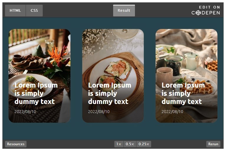
在形象網站上會出現的產品介紹、最新消息文章列表、…等功能,常見會以圖+文的卡片式呈現,這次介紹的範例就是以此樣式再搭配 Hover 動態效果,簡單的步驟為網站添加互動效果。
先設定好 html 的內容:
- 卡片
- a連結作為卡片的連結
- 漂亮的封面
- 文章資訊
- 文章標題
- 文章日期
- 詳細內容
- 描述
- 按鈕
<div class="card">
    <a href="#" class="link"></a>
    <img src="https://images.unsplash.com/photo-1658041153491-53053d40fada" alt="" class="img">
    <div class="info">
      <h2 class="title">Lorem Ipsum is simply dummy text</h2>
      <div class="date">2022/08/10</div>
      <div class="detail">
        <p>Lorem Ipsum is simply dummy text of the printing and typesetting industry. Lorem Ipsum has been the industry's standard dummy text ever since the 1500s</p>
        <a href="#" class="btn-more">Read More</a>
      </div>
    </div>
  </div>
接下來開始設定 CSS 樣式:
#卡片
設定卡片間距、高度、圓角、陰影,另外在卡片的上方增加灰階半透明遮罩,這樣使用各式各樣的封面圖時,就可以降低一些亮度,讓 Hover 效果更自然。
a連結透過 position 定位覆蓋在卡片上方,使整張卡片都可以連結及觸發 Hover 效果。
.card {
  flex: 1;
  margin: 20px;
  height: 320px;
  position: relative;
  overflow: hidden;
  border-radius: 20px; /* 圓角 */
  box-shadow: 0 0 20px rgba(51, 70, 80, 0.5); /* 外陰影 */
}
.card::before {
  content: "";
  position: absolute;
  top: 0;
  left: 0;
  width: 100%;
  height: 100%;
  background: rgba(0, 0, 0, 0)
    linear-gradient(to bottom, rgba(0, 0, 0, 0) 50%, rgba(0, 0, 0, 0.7) 80%); /* 圖片的灰階半透明漸層遮罩 */
  z-index: 0; /* z軸的位置 */
}
a.link {
  position: absolute;
  top: 0;
  left: 0;
  width: 100%;
  height: 100%;
  z-index: 1; /* z軸的位置 */
}
#漂亮的封面
這裡使用 object-fit: cover 讓圖片適應容器寬高,且保持原有比例,但部分内容可能被剪切。
待會會設定 Hover 圖片放大,此處先將漸變設定好 3秒,ease 是漸起始值較慢,中間速率加快,結尾趨的效果。
z 軸讓封面圖片置於底層。
.img {
  width: 100%;
  height: 100%;
  object-fit: cover;
  transition: transform 3s ease;
  position: relative;
  z-index: -1; /* z軸的位置 */
}
#文章資訊
這裡使用 position 定位,所以需要設定寬度,記得扣除間距,才不會溢出範圍。
Hover 時此處的也會有背景變化,同樣加上漸變設定。
.info {
  position: absolute;
  width: calc(100% - 40px); /* 扣除間距,讓資訊保持水平滿版 */
  bottom: 0; /* 靠下對齊 */
  padding: 20px;
  color: #ffffff;
  transition: background-color 1.5s ease;
}
#標題、日期、詳細內容、按鈕
詳細內容區塊預設是隱藏的,將最大高度設定為0、透明度設定為0,再加上漸變設定,秒數的部份目前為止都是設定為不同數值,這樣在觸發 Hover 效果時,些微的數秒差可以讓動畫更有層次感。
記得給預覽文字段落一個最大兩行的限制,並讓溢出文字用刪節號取代。
h2.title {
  transition: color 1s ease;
  margin-bottom: 12px;
}
.date {
  font-size: 14px;
  margin-bottom: 10px;
  color: #ccc;
}
.detail {
  max-height: 0;
  opacity: 0;
  transition: max-height 1.5s ease, opacity 1s ease;
}
.detail p {
  display: -webkit-box;
  -webkit-box-orient: vertical;
  -webkit-line-clamp: 2;
  overflow: hidden;
}
.btn-more {
  width: 80px;
  display: block;
  background-color: black;
  border: 1px solid #fff;
  border-radius: 20px;
  color: #fff;
  font-size: 12px;
  text-align: center;
  margin-left: auto;
  padding: 6px 6px;
  margin-top: 12px;
  text-decoration: none;
}
#Hover 效果
接下來進入到最重要的環節:一連串 Hover 效果的設定。
- 封面圖放大 1.2倍
.card:hover .img {
  transform: scale(1.2);
}
- 滑動時的遮罩效果
.card:hover .info {
  background-color: rgba(0, 0, 0, 0.6);
}
- 計算一下詳細內容的最大高度設定為 78px 及透明度設定為 1。
.card:hover .detail {
  max-height: 78px;
  opacity: 1;
}
- 最後再給標題一個明亮的顏色
.card:hover h2.title {
  color: #ffc107;
}
以上就完成卡片的 Hover 動態效果囉!